Cans and Cardboard Edits

cn6a

As I had expected the visuals I was creating were all quite busy, I had to use large scale sections of the photography to help counteract this. As you can see above I was using lots of small sections or whole cans in some cases and there is just too much going on in each visual, even when I used filters such as colour burn or linear dodge (second and forth) the outcomes were very distracting. I do like the amount of colour I had to work with and could use editing to produce, definitley making the visuals eye catching. My favourite Cans visual is below left as the metal feel of the cans is intensified with the filters I was using as well as it still being very obvious that they are cans this is through a simplified approach on my normal editing process and as I said before larger scaled sections.

cn7

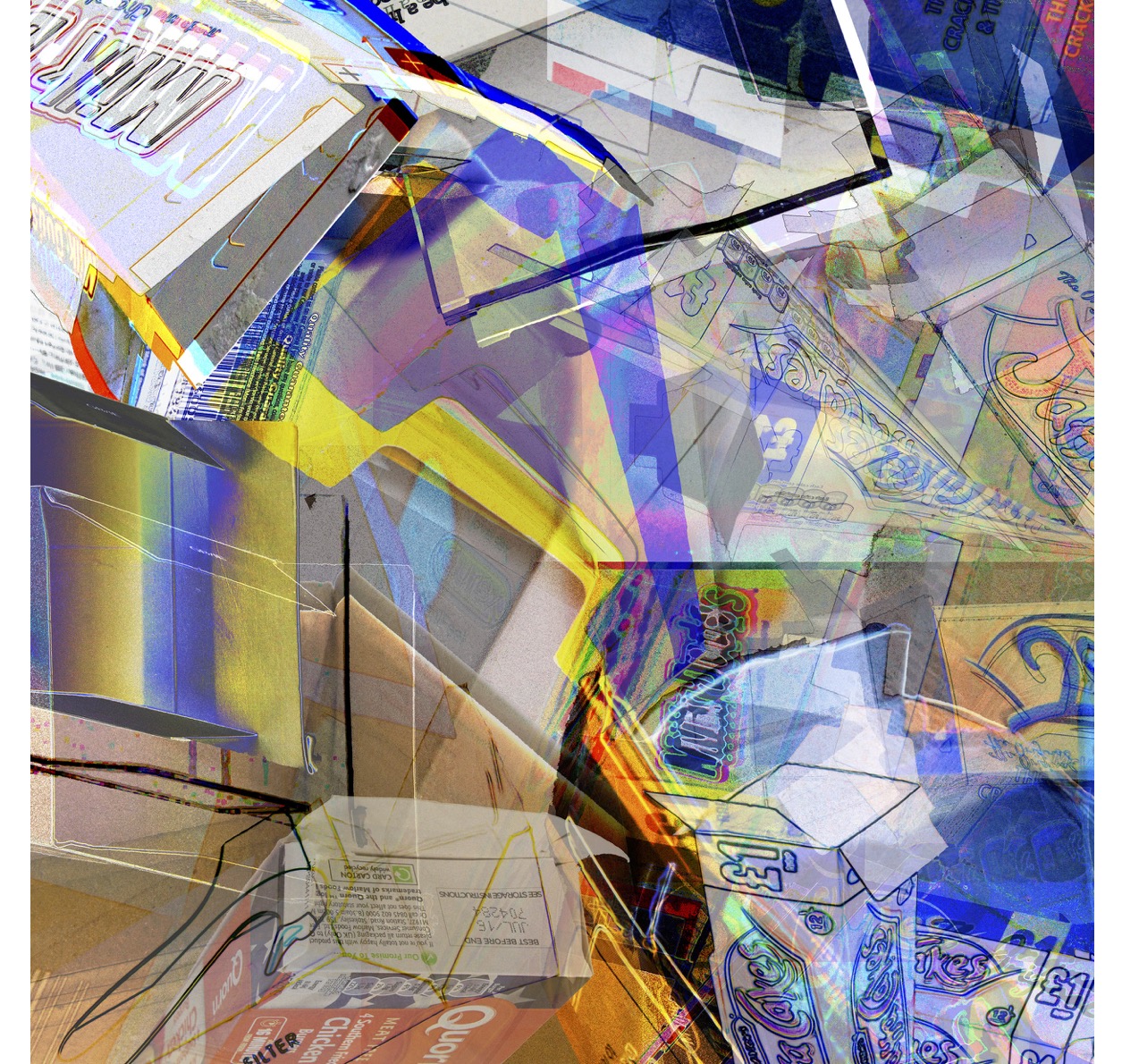
For the Cardboard visual the text and colours made editing quite a challenge and I only came up with one visual in the time I had set myself to do this task. Here I overlaid the same sections on top of themselves quite a bit using different filters and editing techniques to strip away details that were making the overall appearance extremely busy. I found the outlines of the shapes gave the best over all effect so I focused on highlighting these in the editing process.

cr3

Cans and Cardboard Photoshoot

cn3

Photos from photoshoot of cans. Wanted to capture the different shapes and sizes as well as the variety of designs in the branding.

cn1 cn2

Took photos from different angles, the top view showing the ring pull has really interesting shapes and shows the smooth texture of the metal. Also crushed the cans which provided more forms and different lines as well as catching the light in new ways.

cn4 cn5

More formal angles, and compositions.


With the card the lines and fold were the most visually interesting elements for me. The first selection of images are almost documentation of form and the second set plays around with how the different boxes worked together. I had collapsed most of them as this allowed for better appreciation of the structures and therefore more dynamic photography for me to the use in editing.

cr2

The cans and cardboard are both more vibrant in their original forms than the plastic bottles therefore I did not feel as greater need to develop the photoshoots as much as I had for the bottles, i.e. using different lighting and shadows. This however may prove an issue when it comes to editing due to their being ‘too much’ going on in the original images, causing the edits to appear too busy – this is something I will have to be careful with. Especially as now I will already need to consider how my visuals will work in relation to text.

cr1

Response on Plastic Visuals

Showed my plastic edits in my tutorial today. Only really got opportunity to show one of the visuals and none of my photography.

ed6

Feedback: 

Nice visual but not good enough for competition.

Needs text – Play with the word plastic, use clipping mask.

Need to define my one sentence summary of project.

Was asked what I am trying to do – change people’s attitude towards the bin.

Continue making edits for other recycling bins (Cans and Cardboard).


Today’s tutorial was very stressful, feel like I am really not sure what I am supposed to be doing with the project – that I don’t understand the brief correctly, however I have tried to get advice on this and am not coming up with much help. Also that I should have stuck to my very initial ideas of re-designing the bin to make it more interactive, despite the fact that I wasn’t given the opportunity to discuss these in the beginning crit. Beginning to think the way I am working at the moment designing theses visual is very much in a Fine Art way, focusing a lot on the materials and process.

For next week I will have mocked up my three recycling bins. 

Digital Visuals

These are the visuals I have come up with from editing the photos of plastics.

This first one, it is very unclear that the content is plastic bottles.

ed1

Second – The colours on this one are interesting and varied, the edit also has depth. There is contrast between areas of focus and blurred. Again though there is not strong representation of plastic bottles.

Continue reading Digital Visuals

Progress Update

CCA still taking up loads of my time.

Progress on scarf brief is minuscule.

Re-read John Lewis brief, this is a product design brief, redesigning the structure of the packaging, not something I am interested in. For this reason as well as the fact that I am struggling with time managing CCA I have decided to drop the D+AD brief.

I do not think this is a disastrous decision, I am glad I have made it at this point rather than later on, it has taught me to read, re-read and get someone else to read the brief with me next time to make sure I am understanding it correctly and feel confident taking on the task being asked.

JellyFish/JellyBabies

This week we had our first session at The Bridge. Marianne’s puppets this week came in the form of Jellyfish, which in the performance are going to be used under Ultra Violet light so we were using lots of different UV materials and paint  to decorate the bodies and for the tentacles.

Some students require one-to-one support during the process because for example they struggle with dexterity or need to be gently reminded about what they are doing. The range of capabilities, interests and number of students gave me a couple of worries about some of our initial plans to run creative technologies workshops with them. At this stage I think it is important we focus on getting used to the set up of the sessions and watching how Marianne runs them so that when it is our turn to run sessions we are confident we can do a good job.

I personally really enjoyed the experience and the students seemed to as well, they are certainly very engaged with the creative activities and the joy they get is inspiring. They have already made trees and shadow fish puppets, next week we will be making Punk Rockers and then it will be our turn to run a session.