Love Arts Cover Design

This is the final image for the Love Arts cover brief.

I have also done a quick mock up of this image with the necessary text, we have not been asked to submit this but I wanted to do it to double check that it worked visually.

I am very please with the outcome of this brief. It has come a long way from my original ideas, both because one way really graphic and because the other (this idea) felt like quite a difficult task to take on. I have really enjoyed it, acquiring and setting up the props needed, thinking and testing out the photoshoot, then getting some really decent images and being able to deliver something almost exactly as I imagined.

2 balloons Final Programme Cover text

Balloon Photoshoot – Love Arts Cover Design

IMG_4527
Helium, balloon sizer to help blow balloons to same size and not over fill, heart shaped balloons, fishing wire and red ribbon
Canon 5D, camera for the shoot


I stated in a previous post  that once my helium had arrived I would fill on of the heart balloons to go and do some test shots at different locations. The helium arrived this Thursday as expected and luckily it was a beautiful day. So I rushed off the do the test shots. I had four locations in mind, Hartley Crescent Park, Woodhouse Moore/Hyde Park, the park between St Marks Rd and Woodhouse St as well as from the top back bedroom window in my house – if worse came to worse. These are all locations that are on a hill, of varying degrees, hopefully enabling me to get the shot I wanted of the balloons without any visual interference from the ground. I knew that because it was a really sunny day that I would also have people sitting around enjoying the sun to contend with, perhaps meaning I wouldn’t be able to get the right angle on the balloon. I decided my first location would be Hartley Crescent Park as it is quite small and in a quiet spot so there was likely to be less members of the public there than somewhere like Woodhouse Moore/Hyde Park. Continue reading Balloon Photoshoot – Love Arts Cover Design

Love Arts Cover Design Brief Initial Ideas

Love Arts Cover Brief: Leeds College of Art, Visual Communication students

 The task:

To design the cover of the festival programme for Love Arts Leeds 2015

Detail:

Love Arts Leeds is an annual festival around creativity and mental health. This year it takes place in Leeds in October. There will be around 40 events, including: art exhibitions; gigs; theatre performances; arts workshops; talks; film showings; awards ceremony; and more.

Around 2-3000 copies of the Festival Programme will be printed and the information will be available online. The cover must be eye-catching and bold. The image used must also be used on the website.

Your submission should be of 1) A main image 2) A festival programme cover incorporating your image.

Image Details

The image can reflect the theme of mental health and creativity. Previous images have used the heart motif which is in the logo of the festival (see attached). There is no stipulation of media: use photography, illustration, painting, whatever you like.

(Tip: try to avoid being too literal about the idea of ‘mental illness’. Think about the fact that we all have ‘mental health’, just as we all have ‘physical health’, whether good or poor. Think about the idea that arts can help improve well-being.)

Cover Details

The cover should include a main image with text:

Love Arts Leeds 2015

A festival of creativity and mental health

7th – 21st October 2015

You should also include the logo.

 Process

Please submit your design by 01 MAY 2015 (Marianne to confirm submission arrangements)

Please submit your main image and programme cover as separate files.

LA watermark 3

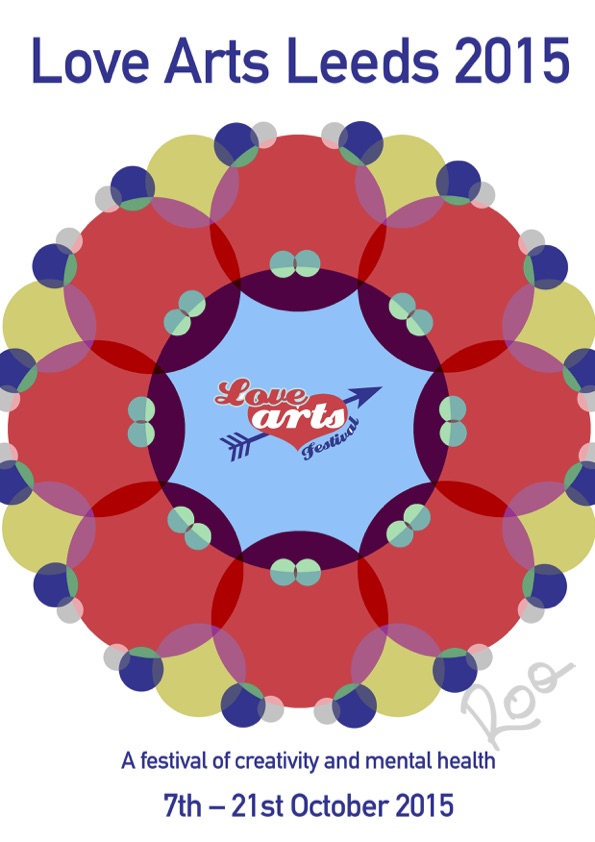
A very graphic design, I used the circles as a representation of everybody’s mental health, as everybody has mental health. These overlap because there will be similarities and differences between everyone and we have the capability to have positive effects on others. There is potential to play around with the pattern of the circles to come up with different designs. I have ideas on how I would like to develop this – asking people to draw their mental health and then I would select circles from to use instead of block colour.

Balloons no white Balloons

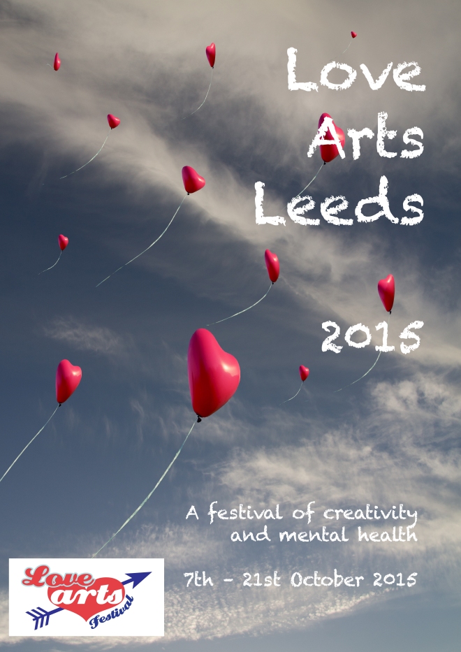
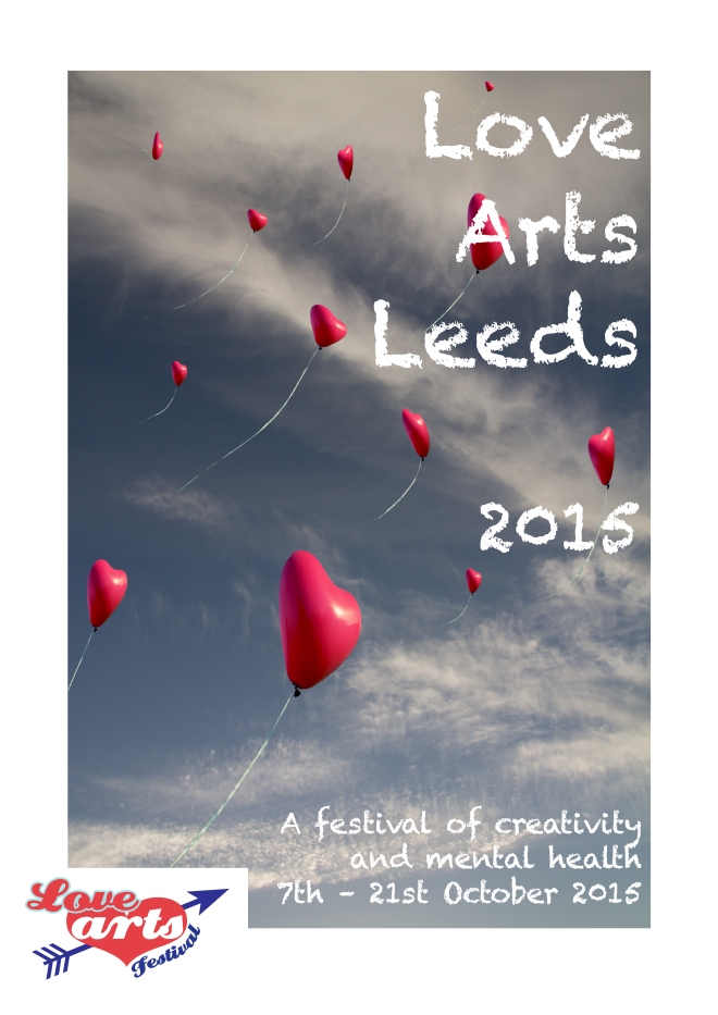
This design more of a mock up as the idea behind it would be to actually get a load of heart balloons and release them, therefore I would have my own photography. Further thinking on that would be to organise it as a bit of an event, individuals each realising a balloon, perhaps with a message or drawing on relating to their personal mental health/how they depict mental health.

Cans and Cardboard Photoshoot

cn3

Photos from photoshoot of cans. Wanted to capture the different shapes and sizes as well as the variety of designs in the branding.

cn1 cn2

Took photos from different angles, the top view showing the ring pull has really interesting shapes and shows the smooth texture of the metal. Also crushed the cans which provided more forms and different lines as well as catching the light in new ways.

cn4 cn5

More formal angles, and compositions.


With the card the lines and fold were the most visually interesting elements for me. The first selection of images are almost documentation of form and the second set plays around with how the different boxes worked together. I had collapsed most of them as this allowed for better appreciation of the structures and therefore more dynamic photography for me to the use in editing.

cr2

The cans and cardboard are both more vibrant in their original forms than the plastic bottles therefore I did not feel as greater need to develop the photoshoots as much as I had for the bottles, i.e. using different lighting and shadows. This however may prove an issue when it comes to editing due to their being ‘too much’ going on in the original images, causing the edits to appear too busy – this is something I will have to be careful with. Especially as now I will already need to consider how my visuals will work in relation to text.

cr1

Cooking

Having written out my own recipes for each meal I then set about following them and cooking each meal.

Before I began cooking the meals I set up the shoot space so that everything was ready to go as soon as the meals were done. I did this on advice from the BBC Good Food and the Digital Photography School websites, where they both say to act quickly when photographing food as things like meat can dry out and herbs can start to wilt (although I did not use any garnish because that does not cater to my audience). They all say it can be helpful to have oil to brush on meat or a spray bottle with water in to counteract the affects of studio lighting. I managed using the room light and carefully placed desk lamps which do not produce as much heat as professional studio lighting does so this wasn’t a measure I felt I had to take. I also took a series of test shots with empty plates to check the lighting and exposure and make sure the camera was set up appropriately.

Pizza Test Shot
Pizza Test Shot

Continue reading Cooking

Shopping

Shopping List
Shopping List

Wrote myself a shopping list, using BBC Good Food recipes for Burgers and Wedges, Curry, Sweet and Sour and Pizza as inspiration. These were the takeaways I originally ordered, I think this is a good starting point for some recipes. I do not plan on following the recipes from BBC Good Food, using them as inspiration to write my own instructions, for example their recipe includes making the burgers but I know that a bare minimum of students would even consider this. But the website is a good source of information for me to use as guidance, then translate into a more student friendly format.

Continue reading Shopping